Friday 20 May 2011

Henrik and Eve enter the Fat Tuesday's annual competition

This year we once again entered the Annual Fat Tuesday Gallery, Photo Competition. The brief for this event was Portraits and Poetry, entries had to include a print of a photo at least A4 in size and some text, either an original piece of poetry or some other text quoted from anywhere, a book, song lyrics, whatever. Henrik and I put our heads together and then decided on two entries each.

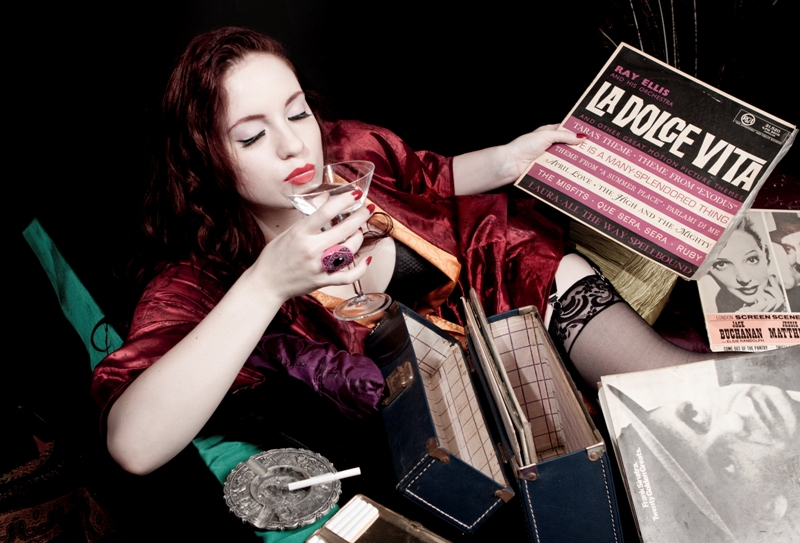
I chose a picture from a recent shoot with the Fabulous Famous Jana (our favourite model for her bubbly nature, stunning good looks and versatility) Henrik also selected one of his entries from one of the first shoots he did with her quite some time ago.
For my second entry I chose a picture I took of Carrie Michelle Wilson at a test shoot I did with a new make-up artist I hadn't used before, Chrizanne of Chrizaane's Makeup Artistry and Hair Styling.
Henrik used a shot he took of Alternative Model, Shanon, which formed part of his Halloween Serial project last year.

The standard of entries this year was very high and we attended a social evening with snacks to view all the photos and hear the judges decisions.

I was fortunate to be chosen as one of the prizewinners winning one of the first prizes in the category, Best Concept (where the photo and words were looked at as a whole concept rather than individually). Other categories were Best Portrait (for the best portrait overall) and Best Poem (specifically for those who had penned their own original text).

This is the first time I have won anything in this competition so I am very excited that I am growing as a photographer.

Here is my winning entry:


Black and White and Red all over? HTFotography gets a new look!

We felt it was time for a new logo.
We had been using the old one that Henrik put together for about two years and it had 2 problems.
Firstly, the wording was not really clear which meant that people were always spelling the name wrong, a big problem when we needed potential customers to make contact through email and our website, both requiring that they be able to spell our name correctly to type in either the URL or the email address.
Secondly the font was beginning to look silly, too much like something a few other people were starting to use for Tattoo parlours, trendy clothing shops and one or two other photographer's watermarks.
We found a designer who had some work we liked the look of and was looking for some new projects to add to his portfolio.
He used our list of needs and came up with a few ideas, we discussed these and he tweeked the logos somewhat and we narrowed down the ideas to a few less and finally he came up with the logo we ended up using.
Since then I have made (very slight) changes until finally we were happy and now we have a brand new shiny logo which works well for us and is easily understood and read and conveys a sense of who we are and what we do.
What do you think?


If you are impressed contact Jurgen Henke. He is the Genius behind our new look.
Thanks for all your hard work Jurgen, we are loving our new look.

Saturday 23 April 2011

Des and her peeps on the beach at sunrise


Ocassionally I make people get out of bed early for shoots. The up side is fantastic light, the downside bleery-eyed clients and photographers and a very cranky three year old.
Until we hit the beach.
Then magic happens.
The three year old loves playing in the sand and watching the bags while Mum and Dad take pictures of people standing on rocks, standing besides rocks and sometimes even jumping off rocks to get away from a wayward wave which threatens to sweep them off the rocks.
Fun times for all concerned and the pictures are fantastic too.
Thanks to Des and Michael for their patience and sunny disposition while I struggled with softboxes and pocketwizards.
The kids looked too cool for their own good.
These people are welcome back in front of my camera anytime.